Product Design — Case Studies

Jessica Pinaowei

UI/UX product designer who takes products from brief to shipped experience, for the Nigerian market first. I design wireframes, prototypes, and interfaces, then work closely with developers and stakeholders to get them right in production. Two projects below, walked through from problem to decision to outcome.

Based Port Harcourt, Nigeria Practice Wireframing · Prototyping · Design systems · Accessibility Collaborates in Figma · Cross-functional teams · AI-assisted dev handoff
Case 01

SafeCommute

PWA · Passenger Safety · Next.js / Supabase
The problem

Public transport in Nigeria carries a real, everyday safety risk that riders manage informally — sharing a trip with a friend over text, memorising a driver's face. There was no shared system for it. SafeCommute set out to make that informal safety net into a real product: something a rider could trust with almost no onboarding friction, because the moment they need it most is the moment they have the least patience for a complicated app.

Key decisions
  • OCR license plate capture at trip start Why: typing a plate number under stress is exactly the kind of task people abandon. Capturing it with the camera removes the one step most likely to get skipped.
  • Trusted contacts as a first-class flow, not a settings afterthought Why: the feature only works if it's set up before a rider needs it — so it's surfaced early, not buried three menus deep.
  • Trip safety notes + explicit success confirmation Why: a safety product has to close the loop. Silence after a trip reads as "nothing happened," which is worse than no feedback at all.
  • Material Design 3 as the visual system Why: chosen for legibility and familiarity on lower-end Android devices, which make up most of the target user base.
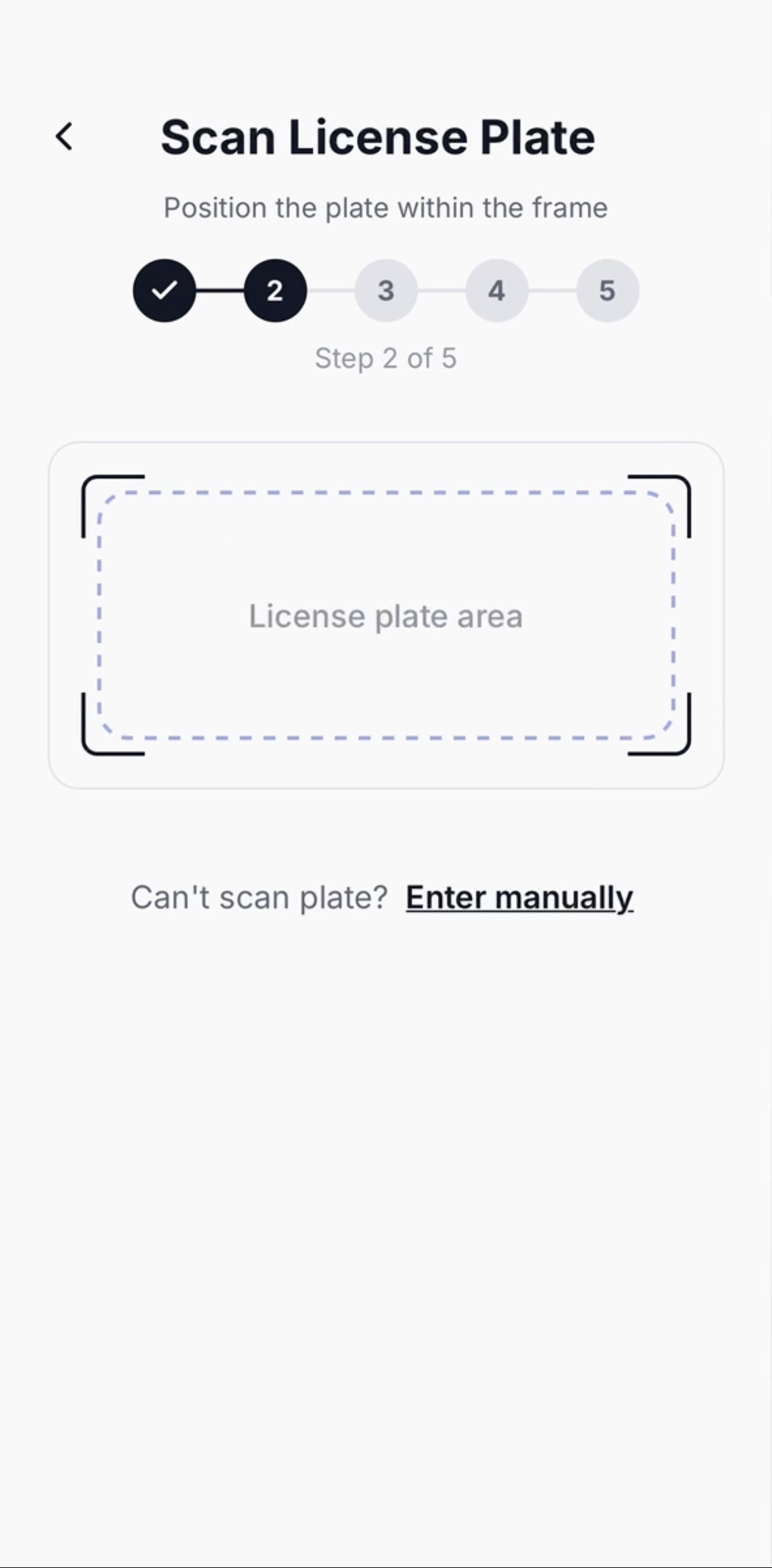
SafeCommute license plate scan screen
Fig. 1 — License plate capture, step 2 of trip setup. A manual-entry fallback stays one tap away for low-light or damaged plates.
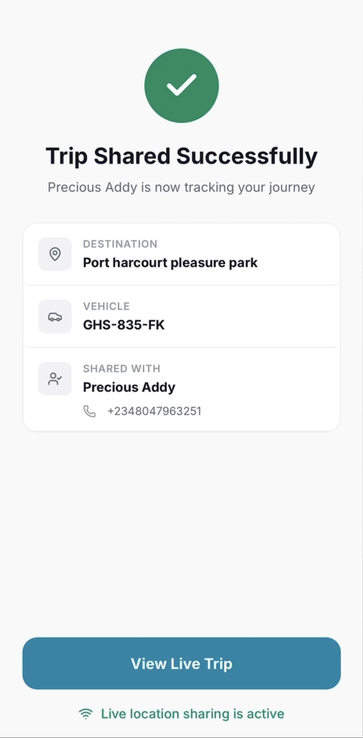
SafeCommute trip shared confirmation screen
Fig. 2 — Trip-shared confirmation: destination, vehicle, and trusted contact surfaced together so the rider can double-check everything at a glance.
Outcome

Beyond the interface, I wrote full architecture and context documentation (Architecture.md, Security.md, Code-style.md, Design-system.md) covering auth, SMS notifications via Africa's Talking, and database schema, so the handoff to developers had no ambiguity between what was designed and what needed to be built.

Case 02

GainWell

Mobile · Health & Nutrition · Kotlin / Swift / Node.js
The problem

Most nutrition apps are built around weight loss, using assumptions and food data that don't reflect Nigerian diets. GainWell flips that brief: a healthy weight-gain app rooted in Nigerian cuisine — which meant the design had to work as hard on cultural fit and accessibility as it did on visual polish.

Key decisions
  • WCAG-accessible design system from the start Why: treated as a foundation, not a retrofit — contrast, type scale, and touch targets were set before any screen was designed.
  • Offline-first interaction design Why: connectivity in the target market is inconsistent, so core flows (logging a meal, checking progress) had to work with no assumption of a live connection.
  • Nigerian English, Naira pricing, NDPR-aware data handling Why: localisation as a design decision, not a translation pass — copy, currency, and data-privacy expectations tuned to the actual user, not a generic global default.
Annotated flow — meal logging

1. Home → prompts a meal log with one tap, no menu diving
2. Meal entry → Nigerian dishes as first-class options, not a "search and hope" text field
3. Confirmation → shows progress toward a weekly calorie-gain target, framed as encouragement, not a deficit warning

This is the thinking sketch, not the shipped screen — happy to walk through the actual UI live.

Outcome

Shared Node.js/Express/PostgreSQL backend powering separate native builds — Kotlin/Jetpack Compose on Android, Swift/SwiftUI on iOS — so the design system had to hold up consistently across two different native design languages, not just one.

Case 03

Nana's Kitchen

Brand Identity · Logo & Social Templates
The problem

A food business with no cohesive brand presence, posting inconsistently with no visual identity tying any of it together. The gap wasn't a lack of effort, it was a lack of a system: no logo, no reusable templates, nothing that let the business post consistently without a designer involved every time.

Key decisions
  • Logo designed as a flexible mark, not a one-off graphic Why: it needed to work as a profile photo, a watermark, and a print element, so it was built to scale down cleanly rather than only look good at one size.
  • Reusable social media templates over one-off posts Why: the real problem was consistency over time, not a single good design. Templates meant the client could keep posting on-brand without needing a designer for every piece of content.
Outcome

Delivered in one month: a logo and a social media template system the client could use independently going forward, turning a one-time design engagement into a lasting brand asset.